I logged in to catch up on my feeds the other night and found that Google has done a major update to their Reader application.
While I do understand that the previous version of Reader was pretty anemic in functionality (I sort of considered that part of Reader’s charm), it is dissappointing they decided to be just like every other RSS reader out there. It now has the obligatory feed tree on the left hand side, which is pretty useless if you prefer to read news in the river of news style that was the center piece of the original Reader UI. There is also way too much blue on screen, and I found myself getting lost when I cycle through posts because of the auto-expand feature. Also gone is the ‘keep unread’ feature, which I used quite often in the old UI (the new UI also seems to have problems with keep unread items if you had some marked as such before you switched over).
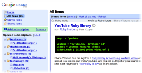
However, all is not bad. Reader now list posts in a format very similar to Gmail, with the benefit of being able to see more posts on screen than with the previous UI. Cycling through posts also seems to be much more responsive than before.
Overall, I think the change is a pretty good step forward for Google Reader as it now has all the features you commonly see with other aggregators, and the UI is comparable if not better than most online aggregators out there. Hopefully, Google will make the necessary changes for the UI to be a better experience for those of us who prefers the river of news style of reading.