Up until now, Google Reader has been very effective in keeping me caught up with my subscribed feeds, but as my number of feeds continue to grow, the limitation in the Reader UI is becoming more and more apparent.
Since the thought of going back to the classic 2- or 3-pane reader makes me want to stop reading RSS altogether, I decided to give the Google Reader API a shot and see if I could come up with a UI that would better suit my reading habits.
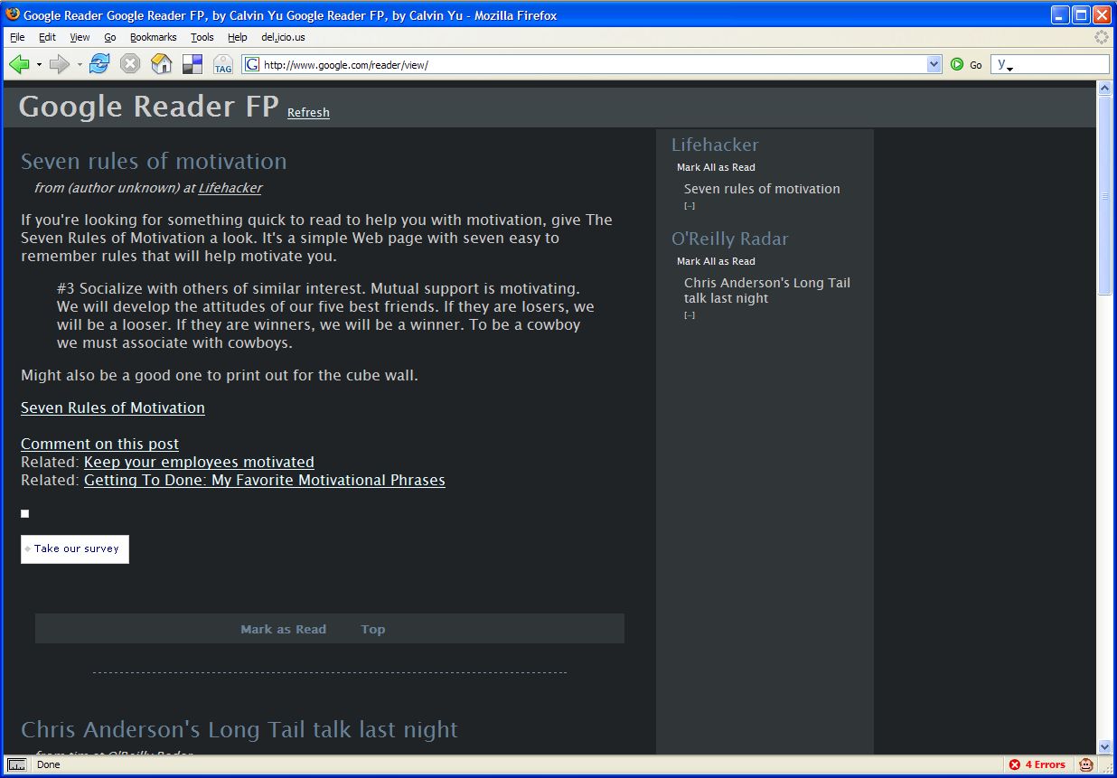
The result of a few days of work resulted in this Reader FP bookmarklet. While there’s still a lot of work to be done to make this the UI I originally envisioned, it is currently usable for me as a replacement for the current Google Reader UI. Here are some of its features:
- The colors are a little softer on the eyes
- The fonts are larger (again better for my eyes)
- The main column shows all the post and their contents (up to 20 entries), this allows me to scan the contents of more the than one post at a time.
- The second column shows the titles of all the posts, group by the feed. A Mark All as Read functionality is available for those feeds that I only occasionally read.
The idea here is to use the second column to scan all available posts by title, and to take out anything I’m not interested in reading. For those feeds that only occasionally have posts I want to read, I use the Mark All as Read functionality to get rid a lot of post quickly.
It’s looking pretty good so far, and I have a couple more features I plan to add - keyboard shortcuts, saving/starring posts. I’ve only tested this bookmarklet on Firefox - I seriously doubt it would work in IE.
Here’s a screenshot of what FP looks like:
